Great landscaping lies in the eyes of its creator. While the principles of landscape design are excellent guidelines to keep a tap on, don't feel like they're the "must-have rules" of landscaping. Use your creativity, but don't misplace the creativity with originality. The landscape design process is a problem-solving process best approached in a systematic manner. The ability to experiment, to learn from mistakes, and build on the experience will help you achieve a truly unique, beautiful landscape you always dreamed of.
The main goal of the landscape design is unity. The idea behind the unity is to create elements that support each other and all work together toward creating a beautiful landscape. It’s about avoiding mixed messages. Garden decor, plant and plants groups should look like they belong together and not be arbitrarily placed. The prime keywords here are repetition and consistency.

Repetition creates unity by repeating similar elements. It's good to have a variety of forms and elements in the garden, but keep in mind that repetition is directly related to unity. Repeating the elements gives an impression of variety. Too many unrelated objects will make a garden look cluttered, wild and unplanned. Yet, too much of one plant or object will make your landscape feel boring and unattractive. However, using several different elements repeatedly, can create unity and keep the garden interesting.
Consistency is a key principle in life; you can't get far without it, and yet, it's most frequently violated. Consistent design is intuitive; it creates unity by default. The cohesive landscape feels secure and safe; the prime molecule of landscape design DNA. Landscape elements should be consistent by height, texture, color schemes, and size.
For example, one of the quickest and most dramatic ways to enhance your landscape is quarried boulders, accent stones, and decorative aggregate. But using different colors and materials would break the design consistency. If you've seen a garden with one large white round boulder here, a large red square granite boulder there, and so on, there is no unity, and the entire design pattern falls apart.
A straightforward way to achieve unity in your landscape is to define themes. And one of the easiest ways to design a theme is using a garden decor or garden statues. Creating a theme garden is easier when it relates to something you have a passion for or interested in.
If you're into butterflies, create a theme using plants that attract butterflies as well as using statues, ornaments, and other decor related to butterflies. If you believe in feng shui, plan curving pathways for chi, garden accessories, art, wind chimes, a generous variety of plants, including evergreens of different sizes and shapes, flowering plants and unusual container collections with low-maintenance in mind.
Unity in landscape design can be expressed through at least one element and preferably more. Using components to convey a central idea through consistent style and a distinct theme brings harmony to your green space.

More often than not in landscape design, keeping it simple works really well. There is a consensus that less is more; that is, less is more striking. Consider simplicity in your design to create balance and beauty. A simple design is peaceful and makes a lasting impression.
In planting, for example, simplicity would be to pick two or three colors and repeat them throughout the landscape. Keep garden decor to a minimum and within a specific theme. Practice simplicity and consistency with hardscapes such as boulders, firepits, and pathways.
One of the main principles of any design is a balance. A balanced landscape feels right; stable and aesthetically pleasing. While some of the elements might be focal points and attract an eye, no one area of the garden must draw an eye so much that you can’t see the other areas. Balancing a landscape involves arranging both positive elements and negative space in such a way that no one space of the design overpowers others. Everything works together and fits in a seamless whole.
There are thousands of chaotic gardens; yet, some of them are charming and romantically unkempt, while others are disorganized and wild. What's the difference? There are two types of balance in design - symmetrical and asymmetrical.
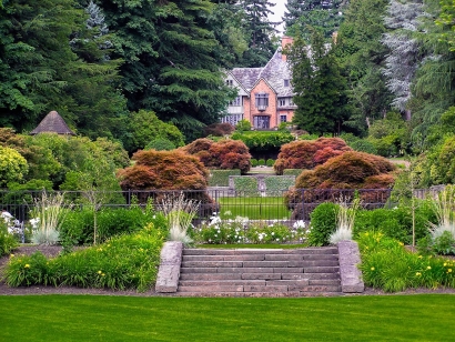
Symmetrical balance is when you have two identical sides of a design with a central point of an axis, so if you cut the picture in half, the left and right are mirroring images of each other. A perfectly symmetrical design has equally weighted visuals on both sides. In landscaping, the symmetrical design draws attention to all areas equally. It's structured and rigid, and possible to achieve in a landscape if space has the potential for symmetrical balance. For example, you have a front yard of a nearly symmetrical house that is flat and equally balanced on both sides. Smaller garden beds can also be used to create symmetry. The perfect symmetry is most often used to create a more formal setting. But most gardens are created with a mix of symmetrical and asymmetrical design elements.

With asymmetrical landscape balance, you have an infinite variety of compositions. The position of elements against forms, shapes, textures, colors, and lines of objects make for a never-ending stream of possibilities. The danger is a chaotic jumble. Using symmetrical and asymmetrical balance together can help you to create equilibrium, and give you the freedom to experiment with any other element, yet to maintain the unity required for a landscape to be pleasing.
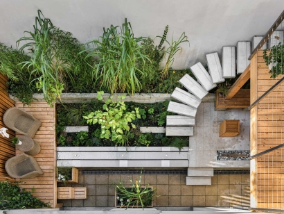
A good example of asymmetrical balance can be asymmetrical bed shapes, or pathways vary on both sides of the dividing line. One side might be curvy with a sense of flow while the other is straight, direct, and hard.

It can also help with contrast. Curvy lines are pleasing to the eye, but the bold contrast of a curve with a straight line can be attractive.
Asymmetrical balance isn't limited to just the shape of your garden.
For example, there might be one side of the garden is mostly large shade trees while the other side is a lower growing flower garden or even a mix of both examples. Use your imagination.
Harmony and contrast and can also be achieved with plants. Fine foliage versus coarser, round leaves versus spiked as well as color contrasts and compliments.
Plant color, height, and texture may be varied from one area to another, but each area should stay consistent within the main theme.
Many successful do-it-yourself designs follow a central theme to achieve most of the principles of landscape design. The conventional use of plants and garden decor or a mix of both is a simple way to make themes.
Colors add the dimension of real life and credit to the landscape. Bright colors like reds, yellows, and oranges can make an object seem closer to you. Cool colors like blues, greens, and pastels make objects visually appear farther from you.

Blacks, grays, and whites are neutral colors and can be used best in the background with bright colors in the foreground. However, to increase depth in a landscape, use coarse-textured, dark plants in the foreground and fine textured and light colored plants in the background.
Colors can also be used to direct attention to a distinct area of the garden. A bright display among cooler colors is naturally eye-catching.
A natural transition can be applied to prevent radical or abrupt changes in your landscape design. A transition is a gradual change. It can be done regarding plant color and height but also can be applied to all elements including textures, size, shape, and foliage of different elements. In other words, a gradual shift can be achieved by the ascending or descending arrangement of elements with diverse textures, forms, sizes, or colors.
For example, a beautiful transition would be a stair level effect from large to medium trees to shrubs to bedding plants.
A transition can be used to "create illusions" in the landscape. For example, a subtle shift from taller to shorter plants can give a sense of depth and distance, making the garden look larger than it really is. A transition from shorter to taller plants might be used to frame a focal point to emphasize it and bring it closer visually.
A line is of the more fundamental principles of landscape design. It relates mostly to the way beds, walkways, sidewalks, and entryways. Everything is the landscape involves line. As you plan your garden, always consider the line created by whatever you are adding.

There are four types of lines: curved, straight, vertical and horizontal. Each has different effects.
A straight line is forceful, direct, evoke a sense of order and formality, while a curvy line has more natural, gentle, flowing effect. Horizontal lines offer a sense of stability, peace, and majesty. Vertical lines create a sense of strength and movement.
Strong garden lines draw the eye into a landscape, directing people where to look and go. Always be aware when a line leads an eye. Lines on the ground going away from you draw you forward. Horizontal ground lines slow you down. Vertical lines take an eye up and away from the garden. Curving lines are adventurous.
Proportion and scale are concerned with size. Proportion is simply related to the size of elements about each other. It is the basic principle of landscape design, but it also requires some thought and planning. For example, a dwarf tree will make more sense in the middle of a small patio that a 25-foot tree. A big house will overpower a narrow front walk with strips of flowers. If you have a small courtyard, a seven-foot garden statue in the center would be way out of proportion. A small four-foot waterfall in the middle of a large open yeard would get lost.

It doesn't mean that if you can't place smaller features in a large yard. Proportion is relative; elements can be scaled to fit by creating different space areas. The goal is to create a harmonious relationship within three-dimensional space.
A small water fountain can be proportionate when positioned on edge or as a focal point of a corner can create a unique atmosphere. You can form a sitting area or theme around it. You can create more than one spaces in your garden to produce multiple visual illusions.
Successful landscape designer generally follows the same pattern in developing their creative ideas, though it can be purely intuitive. Great ideas do not fall from the sky. You can start with experimenting randomly, collecting ideas and skills through reading and experimentation. Working in series, creating themes and spaces is the most important stage of the landscaping design. Creative landscaping is an ongoing process. You don't need to be a professional designer to create a beautiful garden, but systematic approach and understanding of landscape design principles will help you avoid most common mistakes.